Garage
TXGARAGE All-New V7 Design – More Focus on the Reader
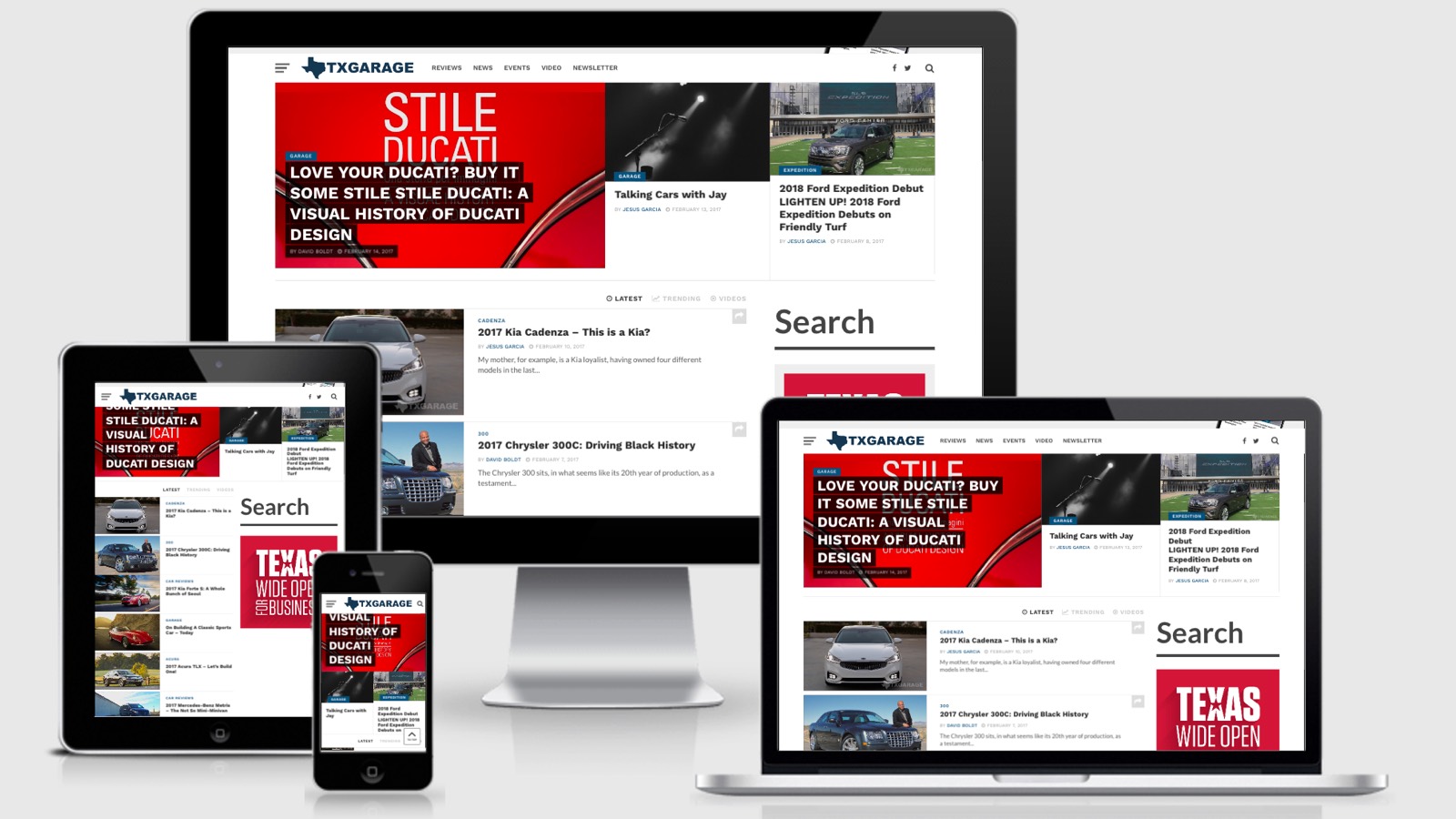
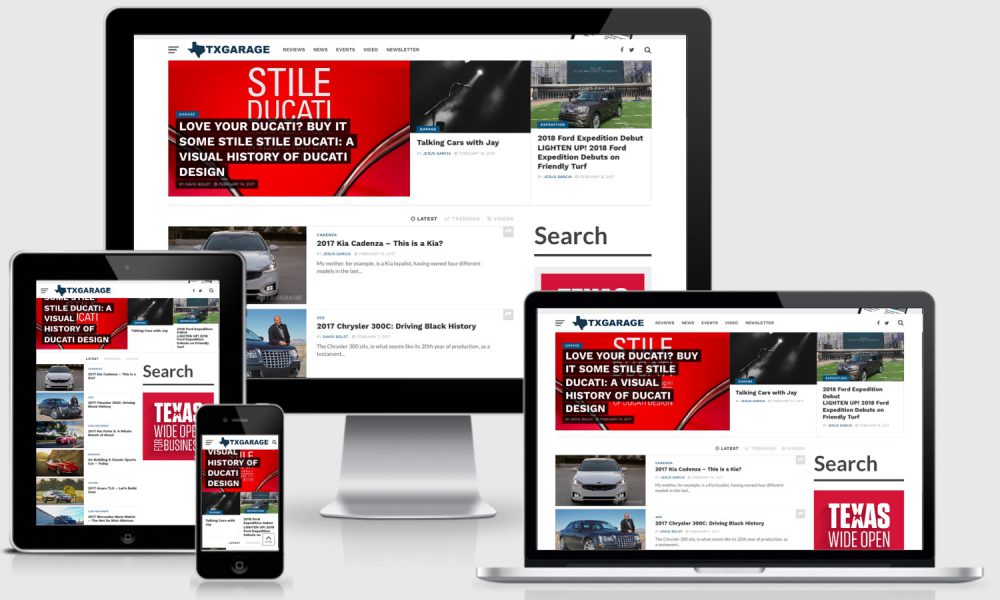
That’s right, we’ve done it once again. While I was happy with our last website design and it served us well for the past year and a half, we’ve gained a ton of traffic and a ton of new content. We wanted a better way to put more content in front of the reader and help with the finding of content on the site. This new design is modern and responsive so that it’s easily read no matter what device you’re on. It also has great searching features and more ways to view posts by category. But enough marketing talk, let’s take a look at what you’re already using to read this post!
Through the Site
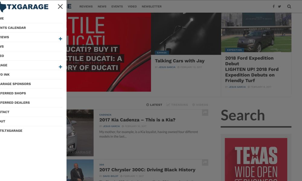
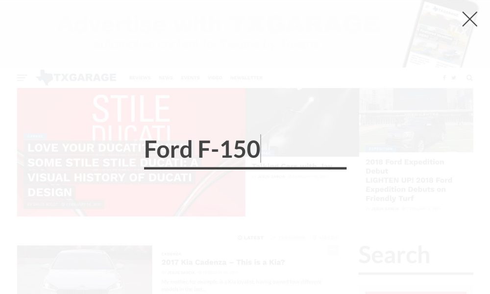
As discussed above, the site is designed to be more functional for the reader and help readers find what they’re looking for quicker. We’ve updated our top navigation bar with a few key features to help in this area. First, on the far right of the navigation bar, you’ll see a search icon. When clicked, this will open a full search box that allows you to easily search for a term – for example, “Ford F-150” and quickly see the results. On the opposite side, the far left, you’ll see a button (using the common 3 lines pattern) which pops out a larger menu. This menu is packed with options that just don’t fit or don’t make sense to always be displayed. For example, you can easily get access to all articles posted in Toyota vehicles. Or easily gain access to our Event Calendar.
No matter what page you’re on you should be able to quickly search for what you’re looking for so, in addition to the search button in the main navigation bar, you’ll also see a search box in the sidebar of most pages. Also in the sidebar of most pages is a list of trending posts that you may be interested in checking out.
If you’re interested in checking out our social media accounts, this is also easily accessed from both the navigation header and in the footer.
The New Homepage
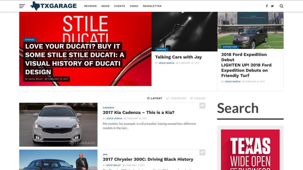
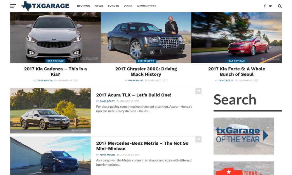
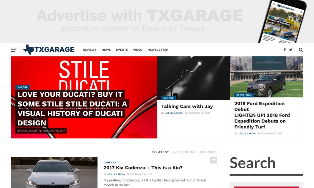
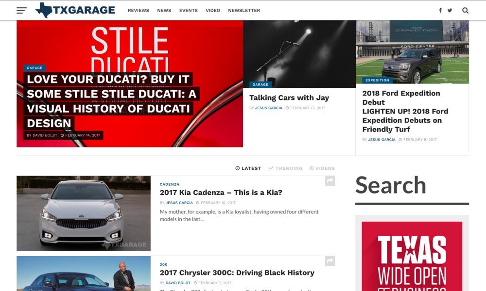
The new homepage shows 3 featured articles at the top followed by a list of the latest published articles. These can be toggled between latest, trending, and videos. Each article block will show you the title of the article, display the cover photo, as well as showing the author’s name and the date posted. I think this is always incredibly helpful when looking for a post to read. You can also now share the post right from the homepage if you so desire. If you’re ready to view more articles you can now click the “More Posts” button at the bottom of the list and they will load in without having to jump from page to page.
The Article Pages
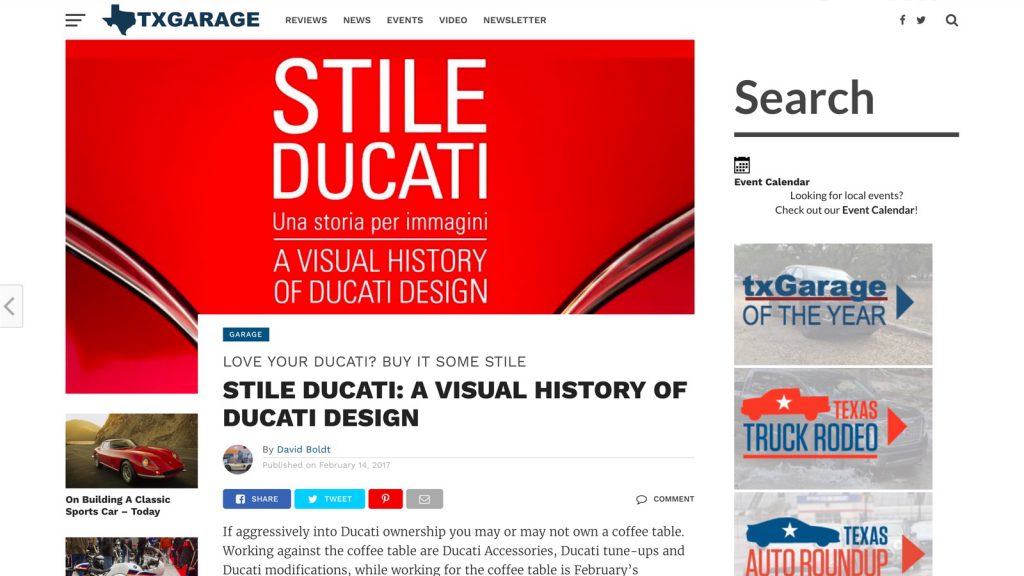
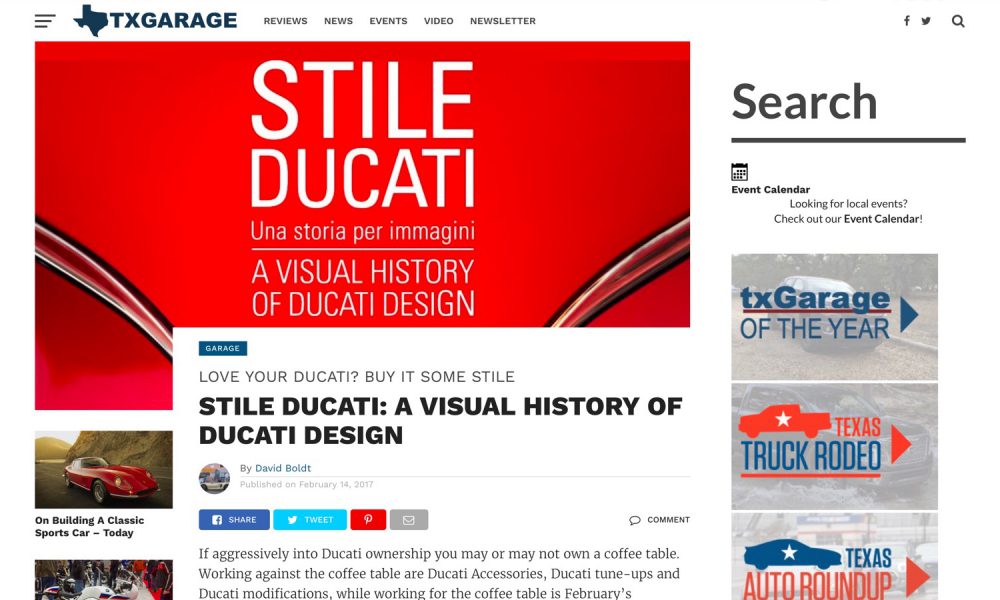
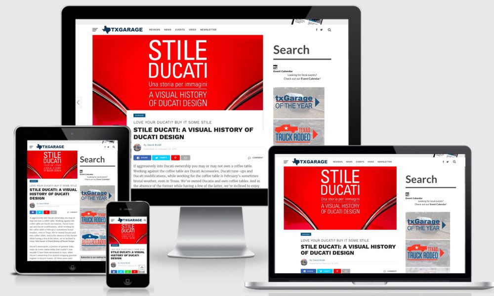
The article pages, where most readers land and view the site from, now have a cleaner design with the cover photo predominately positioned at the top and the title of the article being displayed large and in charge. By the title, you’ll also see the main category the post can be found in, the author’s name, and the date posted. At the end of the article, you’ll also be greeted with more articles that have to do with the same subject. Sharing, commenting, and viewing images have all been improved and made easier for the reader.
We’ve also updated video specific posts will now display the video prominently at the top of the post where the cover photo would normally sit.
More to Come
We have a lot of plans to push more into the TXGARAGE website and we’re looking forward to your feedback on the design and thing you’re looking to see in the future. We’re improving our Event Calendar page so you can easily find local events and we plan on focusing on performance and speed in the future.


